A values-driven identity for a future-oriented broker.
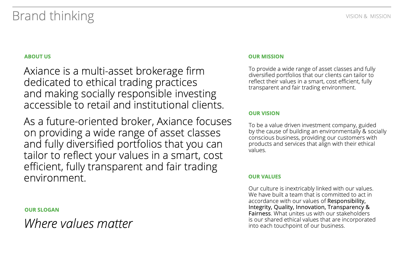
As a new multi-asset brokerage firm guided by the cause of building an environmentally & socially conscious business, the primary focus of Axiance was to provide their customers with products and services that align with their ethical values.
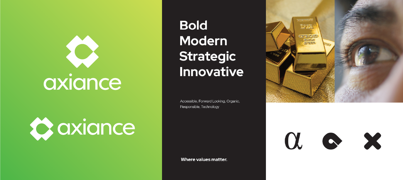
Their slogan “Where Values Matter” became the cornerstone of our branding. The importance of ethics and values in building their brand story informed each step of our strategy and design phases; from the development of the value proposition and mission, to the thinking behind the company name – Axiance (from the Greek word Aξία meaning Value). Finally, we needed to apply this ethos to the overall visual identity of the company.
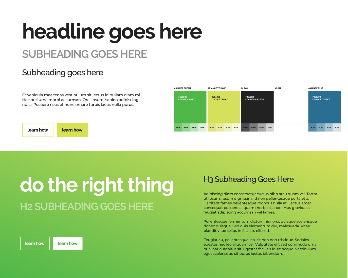
The primary focus of the visual identity was the creation of a unique brand proposition which would align to Axiance’s core business values and help set them apart from their competition. We took our design inspiration from trusted consumer brands that are associated with a high level of ethics, and developed the Axiance identity firmly with the target customer in mind and the business strategy of the company.
The visual emblem represents a bold, innovative and modern company who is accessible, forward looking and socially responsible. The design of the symbol is derived from the Greek letter “α” and developed into an organic shape with colours and tones that convey trust, openness and values.
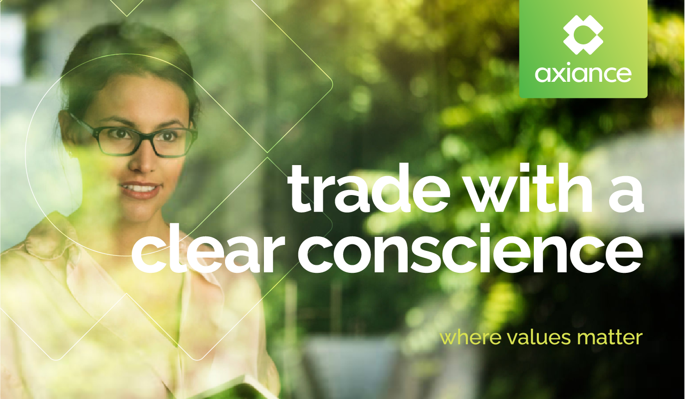
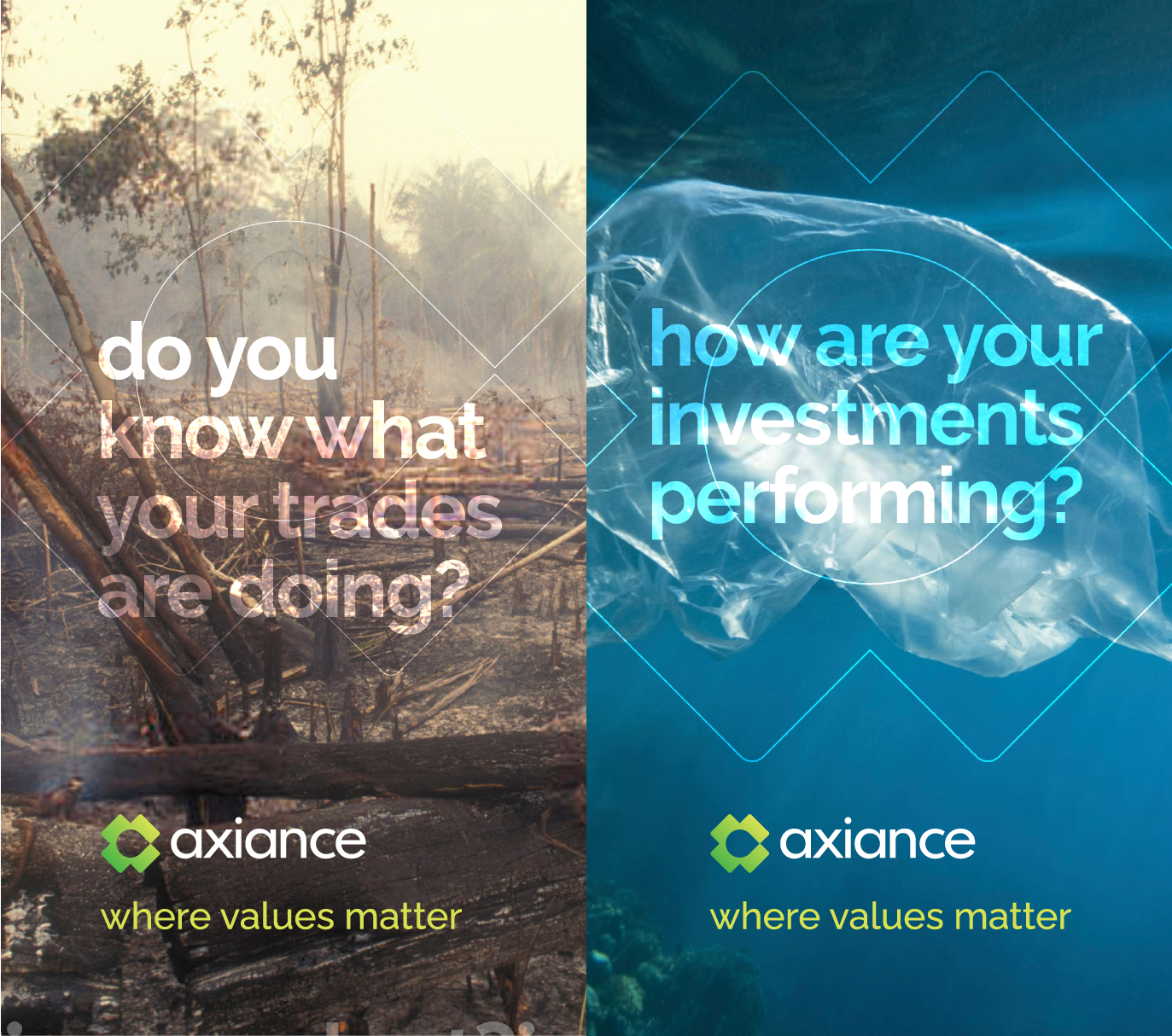
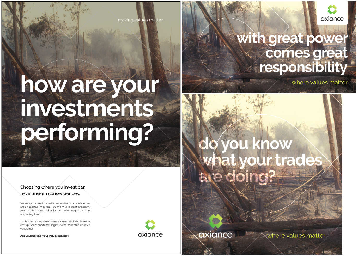
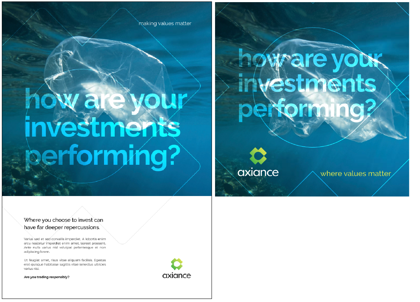
The tone of voice and overall communication aims to align to customer’s thinking and value system, directly and boldly stating the offering of the company and the ethical benefits to the customer.
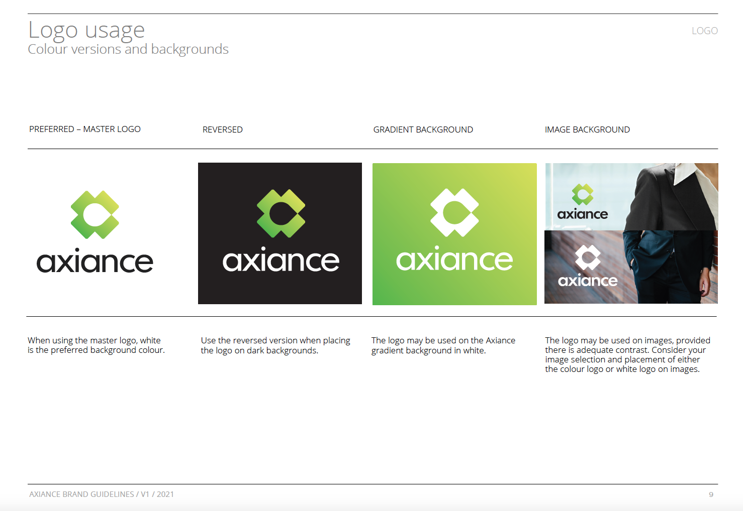
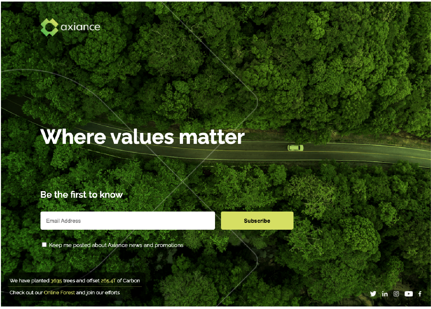
The visual mark lends itself to a wide range of adaptations across their marketing communications and works as a recognizable symbol of a company that has ethics at the heart of its business.
Tags: Brand strategy / Visual identity / Brand Book
